
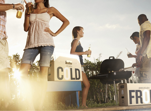
Cardboard Cooler Boxes
Cardboard Cooler Boxes: "
No need to go out and buy a huge plastic cooler for your next outdoor fete, just snap up a couple of these recycled cardboard coolers. It has the same thermal performance as a plastic cooler and can be recycled at the end of its use. No worries about the weather either, as it’s lined with a waterproof coating that makes it reusable and weatherproof. Smart.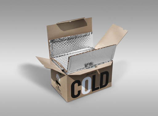
-Stays cool (5 °C) for 36 hours at ambient temperature (25 °C) with two bags of ice (one underneath food and beverages and one on top).
-Composed of 70% recycled cardboard.
-Lined with a NorShield® waterproof coating that makes it weatherproof and reusable.
Dimensions: 51 x 33,5 x 29 cm (20″ x 13 1/4″ x 11 1/2″)
Inside dimensions: 43.2 cm X 30.5 cm X 25.4 cm (17″ x 12″ x 10″)
World’s Largest Consumer Goods Company Proctor & Gamble Vows to Go Green
World’s Largest Consumer Goods Company Proctor & Gamble Vows to Go Green: "

Proctor & Gamble (P&G) – the largest consumer packaged goods company in the world – has just vowed to brush aside the greenwashing of its past in favor of a truly sustainable future. The mega company — which owns such brands as Tide, Crest, Secret Deodorants, Bounty Paper Towels and Eukaneuba pet food, to name a few — just announced its sustainability goals with an in-depth interactive website that shows consumers just where they plan to go. P&G has set goals to make all of their products 100% renewable energy, zero waste, zero pollution, and 100% recyclable , however they’ve not set a single date. So, are they serious – or is this all talk and no planned action?
Core77 + Phaidon Design Challenge: Good Design is Long Lasting
Core77 + Phaidon Design Challenge: Good Design is Long Lasting: "

In support of As Little Design As Possible: The Work of Dieter Rams, Core77 and Phaidon are hosting a design contest to celebrate Rams' work and design principles.
Add your sketch to the Core77 Dieter Rams product timeline which will be exhibited at the Phaidon Flagship store in New York City for a chance to win a copy of the new book.

All entries are due by August 8th. Download the contest rules and official entry form here. PIck your favorite work by Rams from our selection and sumbit your black and white sketch to mail[at]core77.com for our product timeline!
Core77 and Phaidon present...
Good Design is Long Lasting
August 10-24, 2011
Phaidon Store
83 Wooster
New York City
(more...) "
"
Good design is innovative.
Good design makes a product useful.
Good design is aesthetic.
Good design makes a product understandable.
Good design is unobtrusive.
Good design is honest.
Good design is long-lasting.
Good design is thorough down to the last detail.
Good design is environmentally friendly.
Good design is as little design as possible.
In support of As Little Design As Possible: The Work of Dieter Rams, Core77 and Phaidon are hosting a design contest to celebrate Rams' work and design principles.
Add your sketch to the Core77 Dieter Rams product timeline which will be exhibited at the Phaidon Flagship store in New York City for a chance to win a copy of the new book.
All entries are due by August 8th. Download the contest rules and official entry form here. PIck your favorite work by Rams from our selection and sumbit your black and white sketch to mail[at]core77.com for our product timeline!
Core77 and Phaidon present...
Good Design is Long Lasting
August 10-24, 2011
Phaidon Store
83 Wooster
New York City
(more...)
Comfort VS Trend
Comfort VS Trend: "
Simple curves & subtle movements are the philosophy behind this whimsical design by Dutch brand Lonc. The Seaser chair and Teaser stool were specifically designed to minimize effort & physical discomfort while avoiding trend, staying clear of style timelines but maintaining unchanging comfort quality. Upon sitting, the user will find that they are automatically put into an open & extroverted seating position as they are safely embraced by firm armrests. Lightweight & moveable, the design is also completely recyclable.
Designer: Lonc


Bend-and-Snap Mouse!
Bend-and-Snap Mouse!: "
It’s no wonder this design was a 2011 red dot product design Best of the Best winner. A mere 15 mm thick, and composed primarily of flexible silicon, the Microsoft Arc Touch Mouse was designed for on-the-go users, and can fold flat when not in use, making it effortlessly portable while achieving necessary ergonomics. Other innovative features include a touch sensitive scroll function, and a blue light tracking system that allows it to scroll on a broad range of surfaces.
Designers: Donn Koh with One & Co. Design Inc, San Francisco, and Microsoft Industrial Design Team
Microsoft Arc Touch Mouse Spot from Donn Koh on Vimeo.


Cycle Your Way To Power
Cycle Your Way To Power: "
OneBike is quite an innovation I tell you! It’s an electric bike that gets powered by kinetic energy. Basically when you set it on its cradle at home, the bike becomes a stationary fitness machine. So every time you pedal to keep fit, it harnesses energy from your motion and converts it to electric power. Tank up the juice and cruise the roads my friends! Awesome!
Designers: Byoung-soo Choi & Jun-kyeong Kim


"Magnetic Switch Cover" by Jake Frey Is an Attractive Design Indeed
"Magnetic Switch Cover" by Jake Frey Is an Attractive Design Indeed: "
 "
"

Recent ID grad Current ID student Jake Frey earns the nominal honor of designing the best 'combination-light-switch-plate-and-keyholder' with his simple magnetic switch cover, ousting a couple of hook-based contenders that we've recently come across (after the jump; three's a trend?).
It is a standard size switch cover plate with a high power magnet incorporated in the back, so the user can drop their keys when they turn the lights on and come into a room.

If there's not much to describe, suffice it to say that the design speaks for itself... though I wonder if a 'high-power magnet' might affect (or be affected by) the electric current controlled by the switch. In fact, I'm curious if it would be possible to make a magnetic keyholder that activates the lights only when the keys are present (as in some hotel rooms).

Incidentally, it was designed for the Urban Outfitters (they're based in Philly, where Jake will complete his degree next year)... but the simple two-tone design—a subtle nod to the classic horseshoe magnet—says "hipster" more in a whisper than a shout.
(more...)Joel Pirela's Design Classics Posters
Joel Pirela's Design Classics Posters: "
 "
"

Blue Ant Studio's awesome design posters, designed by founder Joel Pirela, go for US $39 and honor the works of Rams, Eames, Saarinen, Nelson and others. The wording on their current promotional (accessible at the first link above) is a little vague, but it sounds like if you buy one you get a second random one for free.

We're digging the eye-chart one, even though we realize that's a literacy test the Average Joe is going to fail.

10 Essential Tips for Creating that Killer Portfolio
10 Essential Tips for Creating that Killer Portfolio: "

It is actually a perfect time to update your portfolio!
Not only are we somewhere in the middle of the year, we are right smack in the middle of summer and it’s blistering out there! Lazing on the beach is not going to get you a job, so why not stay indoors in the air conditioning and take this opportunity to update your portfolio?
I have therefore compiled a list essential and useful tips (I hope!) that can help you churn out that killer portfolio. As a side note, this list was generated while I was teaching students, at the local polytechnic, techniques on how to improve their portfolios.
1) A portfolio is a story about you.
A lot people say a portfolio is a selling tool. I fully agree. But a portfolio is more than that. If you think of your portfolio as a sales tool, you tend to just focus on execution skills or how many pieces of software you can use. A portfolio should instead tell an engaging story about you. It should show, through your projects, where you are in design, your passions, your goals, and your strengths. A good way to start your portfolio story is to have a 2-sentence summary about who and what you are all about.
2) Have an intro page.
This might be a no brainer, but a well-designed introduction page sets the tonality of your portfolio presentation. Many designers just have a title page at the start that says: “Jack’s portfolio.” That’s not good enough. Expanding from the first point you need to share a little about your background to give your portfolio story more depth. Keep it light though; you are summarizing your design career not writing a biography.
3) Keep the number of projects in your portfolio to between 8-10.
As time goes by, you are bound to build a drawer or a hard drive full of design projects that you have played a part in. The trick is to pick 8-10 of your very best projects for your portfolio. Any more than 10, it gets too many and most people cannot remember what they have seen. Run with less than 8 projects, and your portfolio content feels a little light.
There is one caveat to this number, and that is the number of pages per project. If your portfolio tends to have more pages for each project, you should cut the total number of projects down. If you have fewer pages per project, then you may need to bump the total number of projects up.
4) Ensure that projects in your portfolio are no older than 3 years.
To help make your selection process easier, consider removing projects that are older than 3. A big and extensive design project, could sit in your portfolio for up to 5 years as it probably took more than 2 years to complete, but try to avoid anything pass that timeframe as the work could start to look a little dated. When in doubt, prioritize commercial work over concept or schoolwork.
5) Know the purpose of each project in your portfolio.
Every project in your portfolio should have a purpose, a reason for it to exist in your portfolio. That purpose should be somehow related to highlighting your strengths and ability as a designer. Does this project show your potential employer you can deliver award-winning designs? Is this project all about your 3D rendering skills? Or does this project share a little about your design process? In many cases designers tend to double up projects, for example show a lot of 3D work and as a result unknowingly make their portfolio very 3D heavy. Try to avoid repeating skills and be ruthless in your selection criteria.
6) Who did what?
Always be crystal clear when a project you show was group work, and especially highlight your role in that project. Managers are always very happy to hear how designers can work as a team and produce great work. Not only that, as the design industry is small, many designers tend to vie for the same jobs which could put you into an awkward situation.
7) Create customized portfolios.
Selecting and deciding on projects for your portfolio can be hard. On the flip side, having a lot of projects allows you the flexibility of customizing a portfolio suitable to the type of employer or client you will be showing your work to. Are you meeting a marketing guy, or a head of R&D, or perhaps even a CEO? Having a variety of projects and presentation styles helps make your portfolio more relevant to that individual.
8) Know what you want to do as a designer.
Knowing what type of design you want to do can help you build a more engaging portfolio. Do you want to work in a consultancy? What about in an in-house design team, or even in a cross disciplinary role that reports to the CEO?
Knowing what you want in your design career can also help you shape the projects you yet to do. If you want to work in a consultancy, and you find you are weak in 3D rendering skills, this may prompt you to seek out more 3D rendering projects to shore up your portfolio content.
9) A portfolio is a living document.
A portfolio should always be evolving and living in beta. My advice is to update your portfolio every 6 months, or at the very least, update it yearly. Waiting longer tends to allow for work or documentation to go missing. Not only that, a juicy job opportunity might just pop up that could leave you scrambling to get things organize before the submission dateline is over. The Scout’s motto applies here: “Be prepared.”
10) A killer portfolio is well designed.
It is logical that as a designer, you should take every step to make sure that your portfolio is well designed and not just a bunch of images sitting in a plastic folder. Unfortunately, there are a lot of portfolios out there that are poorly designed, even though the content might be acceptable.
Not only it is advisable to have a consistent portfolio layout, the flow and organization of the content should be designed to work in your favor. Do all of your projects start with a beauty shot of the design? What about ensuring a consistent landscape or portrait format? The industrial designers reading this may be forgiven for a poor layout, but the graphic designers will need to be extra careful to ensure their portfolio reflects their capabilities.
A good way to get started is to create a template by using the grid technique (popular with graphic designers) and populate your design work from there. It is always tempting to over style your portfolio, especially if you have a high octane personal brand, but at the end of the day, the best thing to do is keep your layout design simple. You don’t want the background or portfolio layout to overshadow your design work.
11) Bonus tip: Digital vs. Printed portfolio?
With the Internet becoming a standard means of communication, most portfolios are now sent through email. Not only that, more and more designers are presenting their portfolio work on their laptops, iPads and projectors. Don’t discount the paper portfolio though; the honesty and tangibility of the medium could be the winning factor that gets you your next design job.
My point is that it is important to design for the medium. In many cases, a layout for a printed portfolio will not work on a laptop screen or projector. There is a lot more real estate on paper than on a laptop/iPad screen. Paper also tends to be a more forgiving medium as well. A laptop screen’s allows for bright and vibrant images, but a computer screen is limited to so many pixels and zooming breaks the flow of the presentation.
Intuitive Remote
Intuitive Remote: "
This TV remote, a winner of the 2011 red dot design award, was optimized for the revolutionary, easy-to-use SFR “Neufbox Evolution” TV service. The minimal set of buttons helps to intuitively navigate through entertainment features such as live TV, time shifting, video on demand, apps and more – even without need to look at the device or user manual. A dream come true for remote-dummies.
Designer: NDS
SFR Evolution – TV Experience from NDS Design on Vimeo.


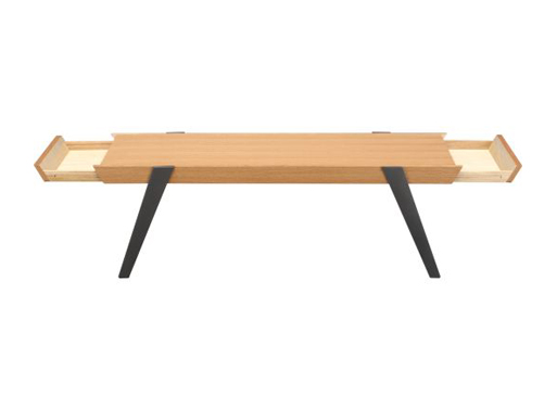
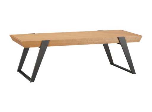
Caliper Coffee Table
Caliper Coffee Table: "
Here’s a coffee table that puts an end to clutter: two hidden drawers reveal storage at each end, making a secret spot to stash away tv remotes, games, and reading materials. Not a bad price either. (There’s some assembly required, but I’m guessing it’s just attaching the legs.)
Exclusive design by Mark Daniel of Slate Design
Quarter-sawn white oak veneer top; natural finish
Made in Taiwan
IDEA Dynamic Headphones
IDEA Dynamic Headphones: "
These minimal headphones look very similar to the Ashidavox ST-90, but have been reworked for better sound and comfort. Music to your ears, right?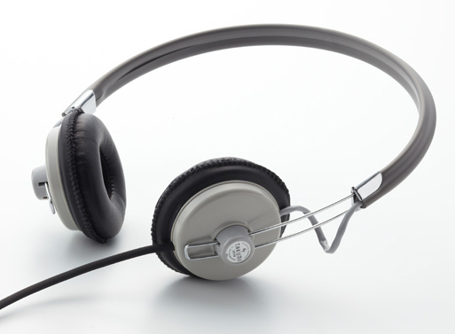
“Instead of a normal urethane, a low-rebound urethane is used for the ear pad to make long hours of listening more comfortable. The 1m cord is fitted with an elbow plug for better durability and is more compact when using with an iPod or iPhone.”
7.08″ x 7.9″ x .5″
Cord: 60″ Straight
Plug: 1/4″ Stereo

Ingenious Students Make a Machine That Turns Art School Waste into Pretty Pencils
Ingenious Students Make a Machine That Turns Art School Waste into Pretty Pencils: "

Art school can be an expensive place – aside from tuition and living expenses, the cost of materials can really take a toll on students’ wallets. Some bright students at the Royal College of Art decided to take the matter into their own hands. Realizing that each department at the school produces its own specific waste, the students recycled that extra material into something every student needs – pencils.
GreenLantern: Liquid Wood LED Lamp Shines a Light on Your Favorite Plant
GreenLantern: Liquid Wood LED Lamp Shines a Light on Your Favorite Plant: "

An amazing new material called Liquid Wood just made its debut in gorgeously curved lamp form. Developed by NuDe, the GreenLantern is a colorful LED lamp with a built-in planter for bringing a burst of greenery to your desk. Designed by Romolo Stanco, the GreenLantern is available in a variety of colors and patterns, and it can even be customized using a downloadable iPhone app!
A “dash” Towards Sustainability with LED Lighting from Steelcase
A “dash” Towards Sustainability with LED Lighting from Steelcase: "
The new dash LED Task Light from Details, a Steelcase brand, is the perfect mix of beauty and brains, which makes all other lighting jealous. Simple and modern, but definitely not boring. Steelcase delivers innovation with this intelligently designed task light.
dash LED Task Light. Manufactured by Steelcase.
A little lamp with a big personality.
The understated design of dash suits many different environments. Available in 9 finishes, with mounting options and features that make this lamp easily placed in any space, for any function. Colors such as “Tangerine” and “Wasabi” add whimsy to an otherwise unassuming lamp. This particular lighting option reduces eye strain thanks to an advanced optical system.


Using considerably less energy, these powerful light sources are replacing the incandescent bulb. In settings such as office buildings, the cost of replacing burnt bulbs can be overwhelming. Products like dash give your wallet something to smile about.

Able to be subtle, or make a statement, dash is not fooling around. This project was two years in the making in a collaboration between Steelcase and Foster + Partners of London, England. This smart light is the first freestanding LED light to gain BIFMA Level 1 certification. It is 97% recyclable with 32% recycled materials. The 8-watt LED only needs to be replaced after 50,000 hours.

This beautiful modern lamp is extremely energy efficient, easily customizable, and effortlessly classic.
Subscribe to:
Posts (Atom)